“Born to Die” tattoos have a dark, poetic, and artistic appeal that makes them especially interesting for music and tattoo lovers. The phrase can stand alone as elegant lettering or become part of a larger design featuring roses, butterflies, hearts, stars, vintage imagery, or celestial elements. I love how the words can create different moods depending on the font, placement, and surrounding artwork. You can keep the tattoo tiny and understated or turn it into a detailed statement piece.
This collection brings together creative ideas inspired by the phrase, giving you plenty of options to consider before your next tattoo appointment.
1. Minimalist Born to Die Tattoo

A minimalist “Born to Die” tattoo is perfect if you prefer simple lettering without additional artwork. A clean serif font or delicate handwritten script can give the phrase an elegant appearance while keeping the design understated. I like placing this tattoo on the inner forearm, wrist, collarbone, ribs, or upper arm. You can use a single line of text or stack the three words vertically for something more distinctive. Keeping the lettering relatively small allows the phrase to remain subtle.
A tiny heart, star, or dot can also be added without taking attention away from the words.
2. Born to Die With Roses Tattoo

Pairing “Born to Die” with roses creates a beautiful contrast between delicate floral imagery and the darker tone of the phrase. You can place roses around the lettering or use one large rose underneath the words. Black and grey shading can make the petals look detailed and dramatic, while red roses create a stronger visual statement. I like this concept on the forearm, thigh, upper arm, ribs, or chest.
A handwritten font can soften the overall design, while bold lettering gives it a more striking appearance. Leaves and small ornamental details can complete the composition.
3. Born to Die Script Tattoo

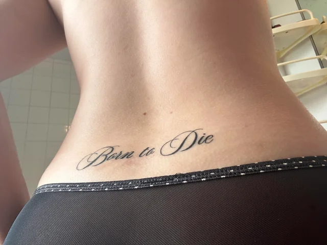
A script “Born to Die” tattoo puts the lettering at the center of attention. Flowing cursive can give the phrase a romantic and artistic appearance, while slightly thicker script creates a more dramatic effect.
I would choose a font that remains readable at the size you want because overly delicate lettering can become difficult to distinguish over time. The forearm, ribs, collarbone, wrist, and upper arm are all suitable placements. You can leave the words completely alone for a clean design or add a tiny underline, star, flower, or heart for a little extra personality.
4. Born to Die With Butterfly Tattoo

A butterfly adds a delicate visual element to a “Born to Die” tattoo while creating an interesting contrast with the phrase. The butterfly can sit above the lettering, replace a decorative element, or appear beside the words. Fine-line artwork works beautifully for this concept because the delicate wings complement elegant typography. I like placing the design along the forearm, shoulder, ribs, or collarbone.
You can choose a black and grey butterfly for a subtle appearance or use colorful wings for stronger contrast. Tiny flowers and stars can also be incorporated to make the composition feel complete.
5. Born to Die With Heart Tattoo

Adding a heart to “Born to Die” creates a simple but visually meaningful tattoo. The heart can appear underneath the phrase, beside the lettering, or be incorporated into one of the words as a decorative element.
I like fine-line hearts paired with clean typography because the combination feels modern and understated. The wrist, forearm, finger, collarbone, and ribs are good placements for a smaller version. You can also choose a shaded or anatomical heart if you want a darker aesthetic. A tiny flower or arrow can be added without making the tattoo feel overly complicated.
6. Born to Die Album-Inspired Tattoo

Fans of Lana Del Rey may want a tattoo inspired specifically by the Born to Die era. Instead of using only the phrase, you can incorporate visual elements associated with the album’s aesthetic, such as roses, vintage typography, feminine portraiture, or ornamental details. I would focus on creating an original composition rather than copying existing album artwork exactly. A black and grey design can capture the moody vintage feeling beautifully. The forearm, upper arm, thigh, back, and ribs offer plenty of space for a larger tribute. Small lettering can also create a subtle reference for longtime fans.
7. Born to Die With Cherry Tattoo

Cherry imagery can give a “Born to Die” tattoo a playful yet vintage appearance. You can place a pair of cherries underneath the phrase or use a cherry branch to frame the lettering.
Red ink can make the fruit stand out against black typography, while black and grey keeps the entire tattoo more understated. I like this concept on the forearm, thigh, ribs, shoulder, or collarbone. A small bow, leaf, or decorative ribbon can be added around the cherries. The result can feel feminine and nostalgic without making the tattoo overly complicated.
8. Born to Die With Bow Tattoo

A bow can add a soft vintage touch to the darker phrase “Born to Die.” You can place the bow above the lettering, underneath it, or use a long ribbon that wraps around the words. Fine-line bows create a delicate appearance, while darker shading can give the artwork a more gothic feel.
I like this idea on the wrist, forearm, thigh, ribs, or collarbone. A red or black bow can create a strong visual accent, while a simple outline keeps the tattoo understated. Small stars or flowers can also be added around the ribbon.
9. Born to Die With Crescent Moon Tattoo

A crescent moon gives the “Born to Die” phrase a mysterious celestial atmosphere. You can position the moon above the lettering or create a vertical composition where stars surround the words. I like fine-line moons because their delicate curves pair beautifully with elegant typography.
The forearm, ribs, shoulder, collarbone, and ankle can all work for this design. Tiny stars and dots can fill the surrounding space without overwhelming the phrase. You can also add a subtle floral element inside the crescent moon if you want a more personalized composition.
10. Born to Die With Angel Wings Tattoo
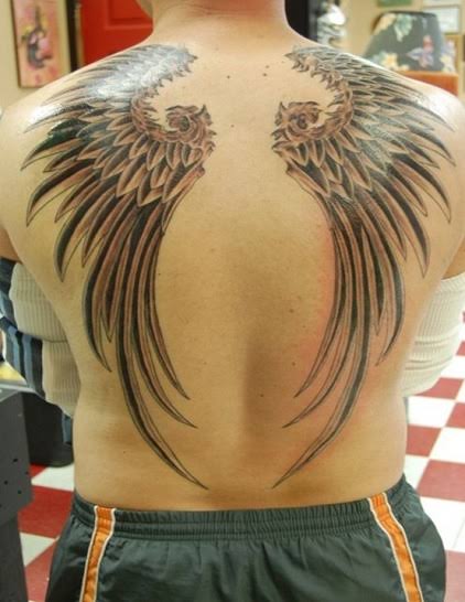
Angel wings can create a dramatic frame around a “Born to Die” tattoo. The phrase can sit between two wings or underneath a smaller pair of feathers. Detailed black and grey shading can make the feathers look realistic, while fine-line wings create a lighter appearance.
I like larger versions on the upper back, chest, thigh, or upper arm because these placements give the wings room to spread. For a smaller tattoo, you can use simplified wing outlines beside the lettering. A tiny halo or star can complete the celestial theme.
11. Born to Die With Dagger Tattoo

A dagger creates a darker and more dramatic aesthetic when paired with “Born to Die.” The lettering can wrap around the dagger or sit underneath it, creating a vertical composition that works especially well on the forearm or thigh. Traditional tattoo styling can add bold outlines and decorative details, while black and grey realism gives the design a more serious appearance.
I like adding a small rose or ornamental handle to soften the imagery. The design can remain relatively simple or become a larger statement piece with additional flowers, stars, or decorative framing.
12. Born to Die With Stars Tattoo

Tiny stars can transform a simple “Born to Die” lettering tattoo into a dreamy celestial design. You can scatter stars around the phrase, place them above the words, or create a small constellation pattern.
I like using different star sizes because it gives the composition movement without requiring heavy detail. Fine-line black ink works beautifully for this concept. The wrist, forearm, collarbone, ribs, and ankle are excellent placements. You can also combine the stars with a crescent moon or tiny flower. Keeping plenty of open space around the lettering helps the tattoo retain a delicate appearance.
13. Born to Die Gothic Tattoo

A gothic “Born to Die” tattoo is perfect if you want a darker and more dramatic aesthetic. Gothic lettering can feature sharp edges, decorative flourishes, and bold strokes that immediately change the personality of the phrase. I like pairing this style with roses, ornamental frames, crosses, or small stars.
The forearm, chest, upper arm, thigh, and ribs can accommodate larger gothic designs. Black ink is a natural choice, especially if you want a strong contrast. Make sure the lettering remains readable because some highly decorative gothic fonts can become difficult to distinguish when used at a small size.
14. Born to Die With Heartbeat Line

A heartbeat line adds an interesting visual connection to the words “Born to Die.” The line can begin beside the phrase, pass underneath it, or connect directly to a small heart. I like minimalist black linework for this idea because it keeps the design clean and modern.
The forearm and wrist are particularly suitable because the heartbeat line naturally follows a horizontal shape. You can also place the tattoo along the ribs or collarbone. Adding a tiny date or initial at the end of the line can make the design more personal without taking attention away from the main phrase.
15. Born to Die With Snake Tattoo

A snake adds a bold and slightly mysterious quality to a “Born to Die” tattoo. The snake can curve around the lettering, move beneath the words, or create a border around the entire composition.
I like realistic black and grey snakes paired with elegant script because the contrast makes both elements stand out. The forearm, thigh, ribs, upper arm, and back are excellent placements. You can add a rose, butterfly, or small moon to create more visual interest. The snake’s natural curves also make this idea easy to adapt to different body shapes.
16. Born to Die With Rose and Dagger
A rose and dagger combination creates a dramatic tattoo that works beautifully with the darker mood of “Born to Die.” The dagger can run vertically through the design while a rose sits beside it, creating contrast between sharp metal and soft petals.
The phrase can be placed underneath or wrapped around the composition. I like black and grey shading for this concept, although a red rose can provide a striking accent. The forearm, thigh, upper arm, calf, and chest offer enough room for a detailed design. Ornamental lines can help connect all three elements.
17. Born to Die With Vintage Frame

A vintage frame can give a “Born to Die” tattoo an old-fashioned, artistic appearance. The phrase can sit inside an ornate rectangular or oval frame decorated with flourishes, flowers, ribbons, or tiny stars.
I like this concept because it makes the lettering look almost like an antique sign or artwork. Black ink with subtle shading can create a classic appearance, while fine-line details keep the design elegant. The forearm, upper arm, thigh, ribs, and chest are suitable placements. A small frame can also work on the wrist if you simplify the decorative details.
18. Born to Die With Butterfly and Rose
Combining a butterfly and rose with “Born to Die” creates a detailed floral tattoo with a strong visual contrast.
The butterfly can rest on the rose while the phrase sits underneath or curves around the flowers. Fine-line artwork gives the design a delicate appearance, while black and grey realism can make the composition much more dramatic. I like using a larger placement such as the thigh, shoulder, forearm, or upper arm for this idea. You can add a tiny date or initial to make the artwork personal without overwhelming the main phrase.
19. Born to Die Vertical Tattoo

A vertical “Born to Die” tattoo is a creative alternative to traditional horizontal lettering. Each word can be stacked along the forearm, ribs, spine, or calf, creating a long and elegant composition.
I like using a simple serif or handwritten font so the words remain readable while maintaining a stylish appearance. Small stars, flowers, or decorative lines can be placed between the words. The forearm is particularly suitable because its natural length supports the vertical format. This design is also easy to personalize through different fonts, spacing, and small symbols.
20. Born to Die With Flaming Heart
A flaming heart gives “Born to Die” a bold and dramatic aesthetic. The heart can sit above the lettering or become the central image, with flames extending around it. Traditional tattoo styling can make the flames and heart highly graphic, while black and grey shading can create a darker appearance.
I like this concept on the forearm, upper arm, thigh, chest, or calf. You can add small roses, stars, or decorative lines around the heart. If you prefer a softer version, thin outlines and minimal flame details can keep the design relatively understated.
21. Born to Die With Vintage Car

A vintage car can give a “Born to Die” tattoo a strong retro-inspired aesthetic. You can use a classic automobile as the central image and place the phrase underneath it in elegant lettering. Black and grey realism works well for capturing the shape and details of an older car.
I like adding roses, palm trees, or small stars around the design to create a complete composition. The thigh, forearm, upper arm, chest, and back offer enough space for this concept. It can be a particularly fun tribute for fans who enjoy vintage visual themes.
22. Born to Die Floral Script Tattoo
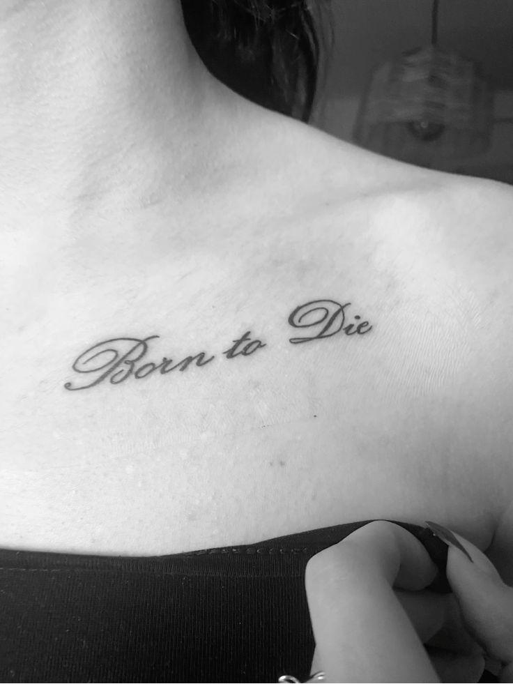
A floral script “Born to Die” tattoo brings together elegant lettering and delicate botanical details. You can weave small flowers and leaves around the words or use a floral stem as an underline. Roses, daisies, wildflowers, and tiny blossoms can all work beautifully with script lettering. I like fine-line black ink for this style because it keeps the design graceful and cohesive.
The collarbone, forearm, ribs, shoulder, thigh, and upper arm are excellent placements. You can also add a small butterfly or star if you want a little more visual interest without making the tattoo feel crowded.
“Born to Die” tattoos can create a distinctive piece of body art that combines meaningful words with beautiful visual details. Simple lettering can feel elegant, while roses, butterflies, bows, moons, stars, daggers, and vintage imagery can create a more elaborate design.
I especially like tattoos that use typography as the main feature and add only a few carefully chosen elements around it. Think about the font, placement, size, and artwork you want before your appointment. If the phrase has personal meaning for you, choose a design that reflects your own style rather than copying another tattoo exactly. A thoughtful composition can make this phrase feel completely unique.